Product Search Result Item
Shopify Storefront data and cart logic is bound to your Webflow elements through Shopyflow attributes. Connecting your Webflow site to Shopify is done by adding custom attributes to your Webflow elements.
Yet, you are not required to type or edit attributes manually. Shopyflow provides you with the pre-configured components needed to create your store, as copyable Webflow elements right in Webflow designer.
All the copyable Shopyflow Components are native editable Webflow elements. There is no layout or styling limitation on any element.
In the below image hover your mouse on the hotspots to see all the required Shopyflow attributes to build a product page like this in Webflow

Contains the product information for each search result item. Product Search Result Item is a Div Block with the attribute sf-search-result-item.
Storesynk requires you to have Product Search Result Item component including the children components to be used as a template. The Product Search Result Item template is cloned and iterated for all the search results items and appended into Product Search Result List.
Webflow app usage
Webflow app settings
Inner components
Module contents
Available methods
Product Image
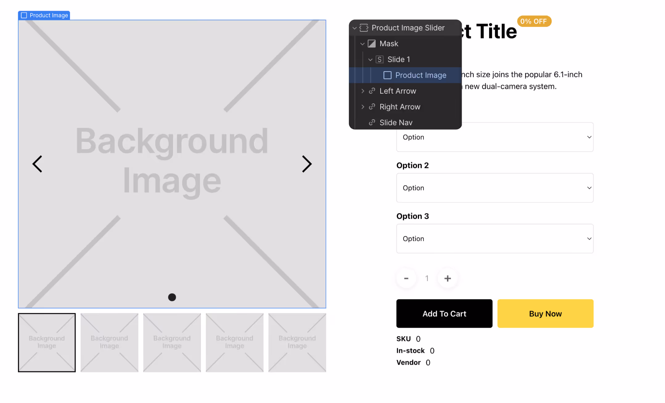
Displays the product image for the selected variant as set in Shopify. Product Image is a Div Block with the attribute sf-show-image.
An Image element can as well be used as the Product Image component. In the cases when the Div Block is used; the current product image is dynamically set as a background image to the element on page load. Make sure the background position and the background size properties of the element is set as intended in Webflow
Product Title
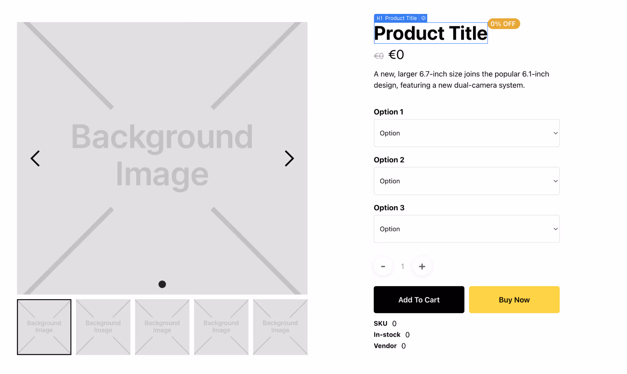
Displays the name of the product as set in Shopify. Product Title is a Heading element with the sf-show-title attribute. The content of the element is overriden with the Shopify name of the current product on page load.
Vendor
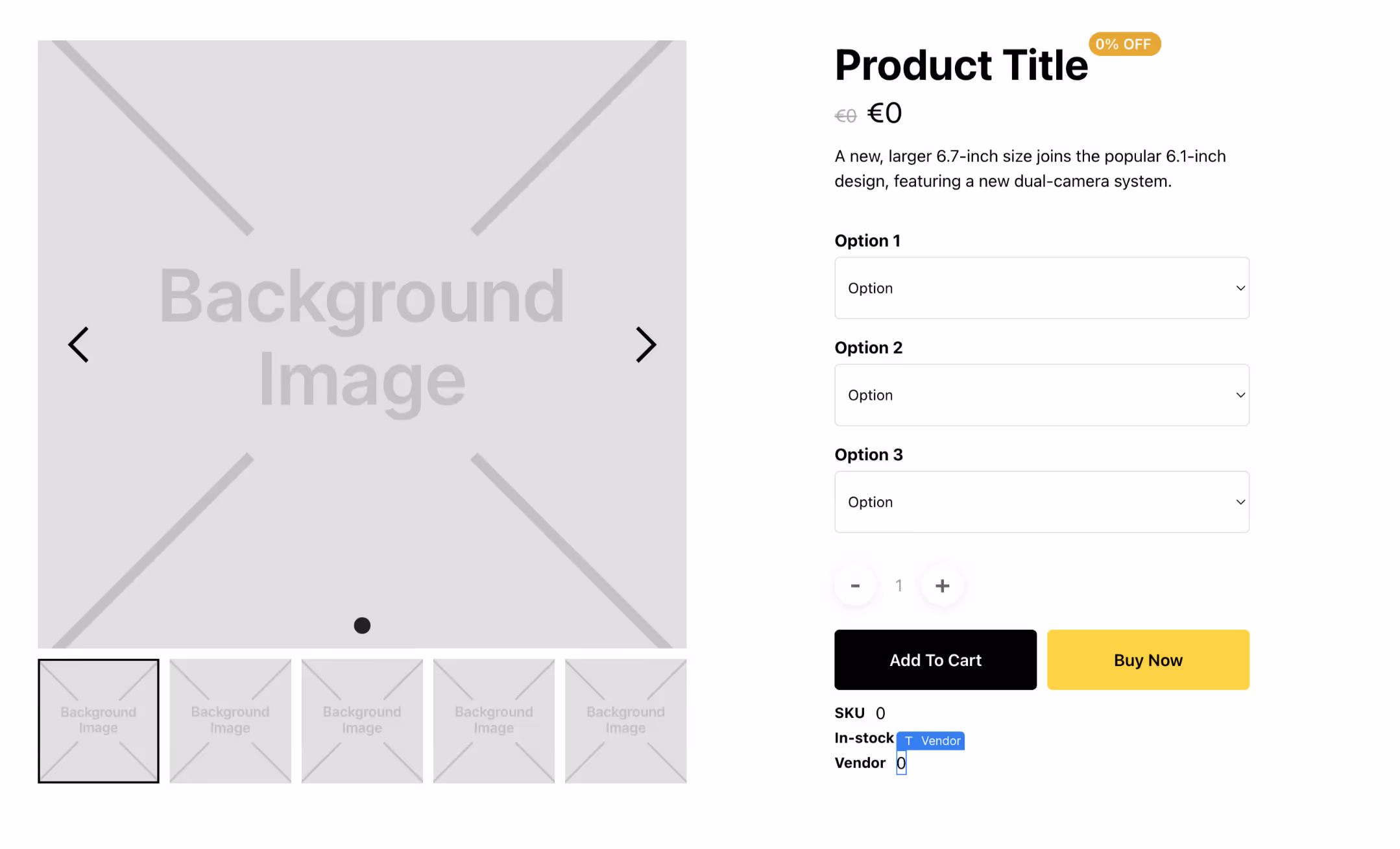
Displays the vendor name of the current Product. Vendor displayer is a Text Block with the sf-show-vendor attribute.
Price

Displays the price of the selected variant as set in Shopify. Price component is a Text Block with the sf-show-price attribute. The attribute stores calculation logic selection as the attribute value.
Price Formatting
Shopyflow uses Shopify's currency formatting when displaying price in the CMS and on the page. Follow the steps below to change your price formating:
- Go to Shopify Admin > General.
- In the Store defaults section, click …, and then click Change currency formatting.
- In each of the fields, replace
{{amount}}with the currency format that you want to use from the options table. - Click Save.
Additionally Shopyflow supports the following formats:
- {{amount_one_decimal}}
- {{amount_two_ decimals}}
- {{amount_no_decimals_with_comma_separator}}
- {{amount_one_decimal_with_comma_separator}}
- {{amount_two_decimals_with_comma_separator}}
- {{amount_no_decimals_with_space_separator}}
- {{amount_one_decimal_with_space_separator}}
- {{amount_two_decimals_with_space_separator}}
Currency Symbol
By default Shopyflow displays the currencies in browser's language format. This is the recommended way as it takes your customer's browser preferences into account. However if you want to change this behaviour, you can go to Shopyflow Webflow App > Installation > General Settings > Price Display Settings and select another format.
By doing so you can e.g. show Canadian Dollar as $ instead of CA$
Compare Price
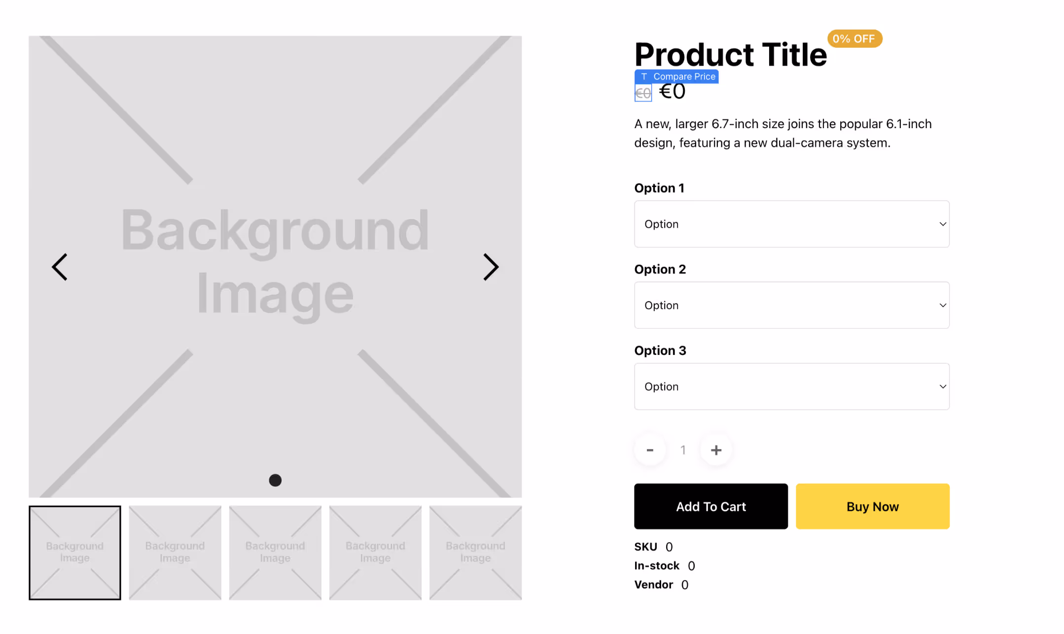
Displays the compare price of the selected variant as set in Shopify. Compare Price component is a Text Block with the sf-show-compare-price attribute. The attribute stores calculation logic as the attribute value.
Component
contents
Product Image
Displays the product image for the selected variant as set in Shopify. Product Image is a Div Block with the attribute sf-show-image.
An Image element can as well be used as the Product Image component. In the cases when the Div Block is used; the current product image is dynamically set as a background image to the element on page load. Make sure the background position and the background size properties of the element is set as intended in Webflow
Webflow app usage
- Select the Product container in the Webflow designer
- In the Shopyflow app; click add new
- Select Product Image.
- Select the Product Container again
- Paste Product Image component
Webflow app settings
Product Title
Displays the name of the product as set in Shopify. Product Title is a Heading element with the sf-show-title attribute. The content of the element is overriden with the Shopify name of the current product on page load.
Webflow app usage
- Select the Product Container in the Webflow designer
- In the Storesynk app; click add new
- Select Product Title.
- Select the Product Container again
- Paste Product Title component
Webflow app settings
Vendor
Displays the vendor name of the current Product. Vendor displayer is a Text Block with the sf-show-vendor attribute.
Webflow app usage
- Select the Product Container in the Webflow designer
- In the Storesynk app; click add new
- Select Vendor .
- Select the Product Container again
- Paste Vendor component
Webflow app settings
Price
Displays the price of the selected variant as set in Shopify. Price component is a Text Block with the sf-show-price attribute. The attribute stores calculation logic selection as the attribute value.
Price Formatting
Shopyflow uses Shopify's currency formatting when displaying price in the CMS and on the page. Follow the steps below to change your price formating:
- Go to Shopify Admin > General.
- In the Store defaults section, click …, and then click Change currency formatting.
- In each of the fields, replace
{{amount}}with the currency format that you want to use from the options table. - Click Save.
Additionally Shopyflow supports the following formats:
- {{amount_one_decimal}}
- {{amount_two_ decimals}}
- {{amount_no_decimals_with_comma_separator}}
- {{amount_one_decimal_with_comma_separator}}
- {{amount_two_decimals_with_comma_separator}}
- {{amount_no_decimals_with_space_separator}}
- {{amount_one_decimal_with_space_separator}}
- {{amount_two_decimals_with_space_separator}}
Currency Symbol
By default Shopyflow displays the currencies in browser's language format. This is the recommended way as it takes your customer's browser preferences into account. However if you want to change this behaviour, you can go to Shopyflow Webflow App > Installation > General Settings > Price Display Settings and select another format.
By doing so you can e.g. show Canadian Dollar as $ instead of CA$
Webflow app usage
- Select the Product Container in the Webflow designer
- In the Shopyflow app; click Add new
- Select Price
- Select the Product Container again
- Paste Price component
Webflow app settings
Calculation Logic
default: The component shows unit price of the selected variant.
with-quantity: The component shows the price of the selected variant after multiplying it with the selected quantity.
with-sub-product: The component shows the price of the selected variant after adding it with the price of the sub-product (if selected by the customer)
all: The component shows the price of the selected variant using both the quantity multiplier and the sub-product price addition.

Compare Price
Displays the compare price of the selected variant as set in Shopify. Compare Price component is a Text Block with the sf-show-compare-price attribute. The attribute stores calculation logic as the attribute value.
Webflow app usage
- Select the Product Container in the Webflow designer
- In the Storesynk app; click Add new
- Select Compare Price
- Select the Product Container again
- Paste Compare Price component
Webflow app settings
Calculation Logic
default: The component shows unit price of the selected variant.
with-quantity: The component shows the price of the selected variant after multiplying it with the selected quantity.
with-sub-product: The component shows the price of the selected variant after adding it with the price of the sub-product (if selected by the customer)
all: The component shows the price of the selected variant using both the quantity multiplier and the sub-product price addition.
State management
Related Utilities
Product Link
Product Link links any element to a product page.
For example if you add the sf-product-link attribute to a link element on or inside a Cart Item, it will convert the element to a link that goes to that product's detail page. Similarly, if you add it to a Product Search Result Item, it will link the search result element to that product's detail page.
If you are using a product page path other than "Products" do the following !
If you are using a product page path other than "products", you need to set it in Storesynk Webflow App > Installation > General Settings
For example if your product page path is "articles", you need to type in "articles" in the app.